Client name:
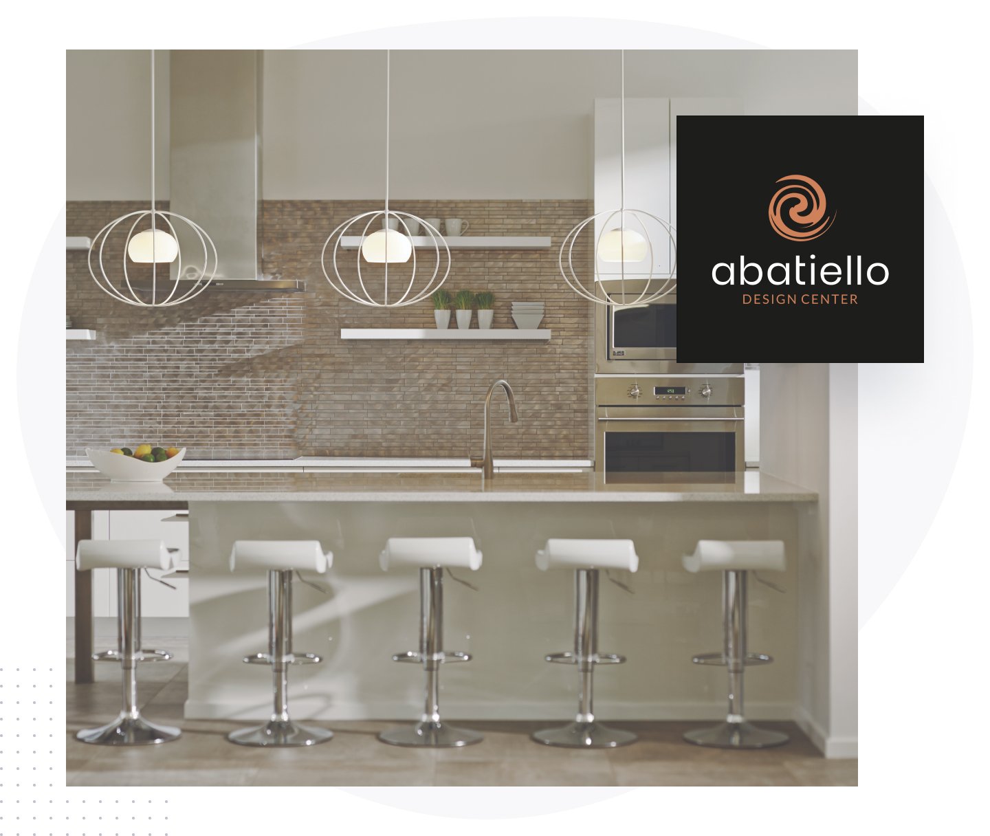
Abatiello Design Center
About the client:
Abatiello Design Center is a Vermont based residential & commercial Construction company serving all of Vermont and parts of New York, Massachusetts and New Hampshire.
Date of Project:
April, 2021
Website:
www.abatiellodesigncenter.com/
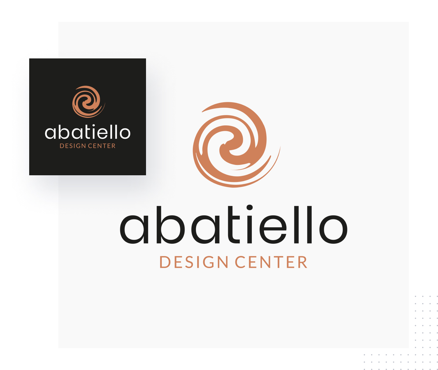
After years of operation, Abatiello Design Center knew it was a perfect opportunity for a logo refresh.
They wanted to redefine themselves from being just another construction company to something bigger – “construction and flooring experts” while showcasing their strengths in new ways that would make them stand out among their competitors.
And this change can start by getting a logo update.
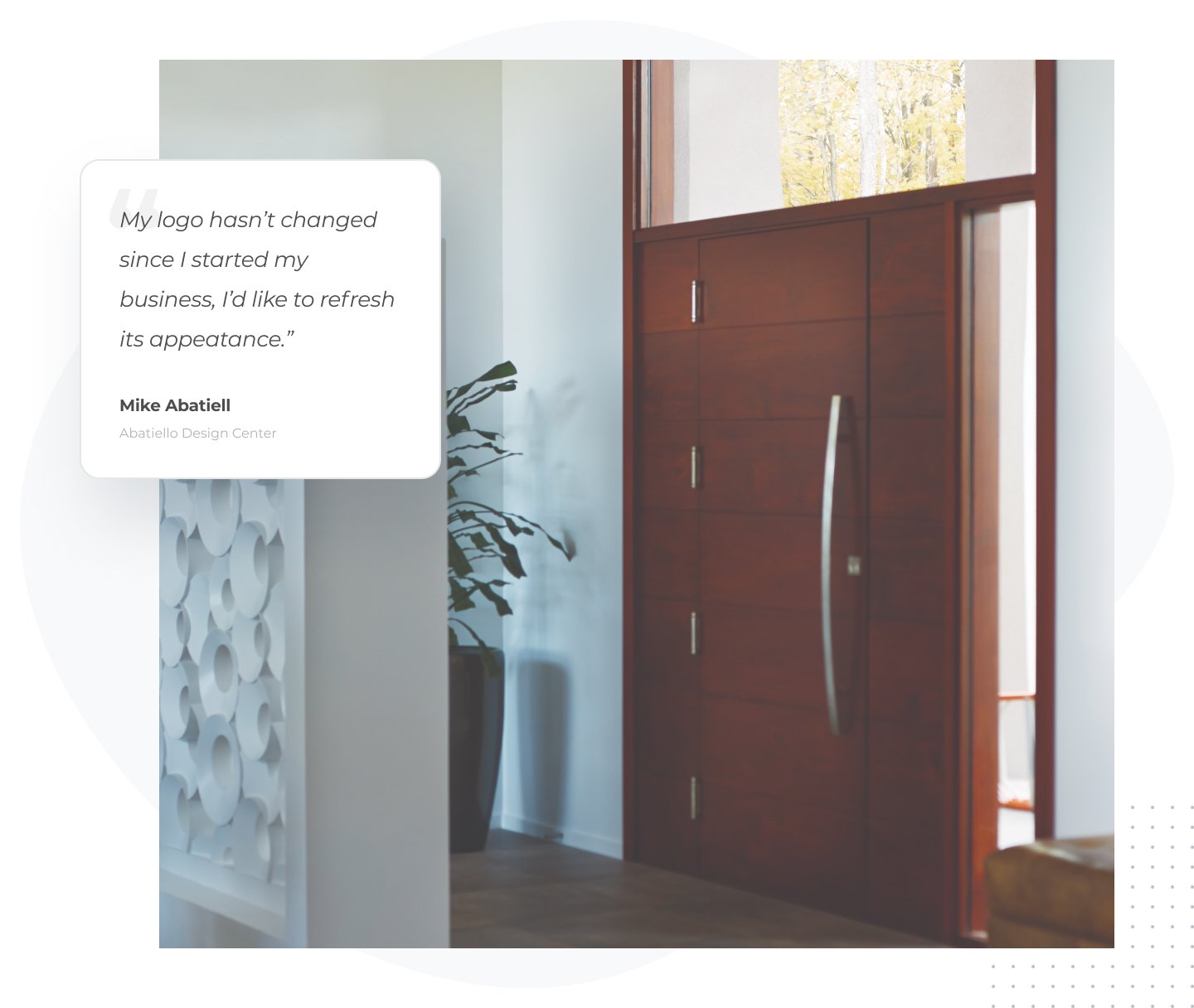
The previous logo lacks a clean and professional visual appearance, font styles and placement, making it hard to read and not aesthetically pleasing.
In order to make it more appealing, we planned to create a simple and eye-catching logo design, incorporating some of the original characteristics. A replacement of the font style is a great means to add personality and creative flare to the brand.
It’s always best to keep the same feeling and spirit of what made them a reliable and trustworthy construction and flooring company. Updating the logo design and improving the font styles is simple and effective, making it more attractive, clearer, and readable without completely changing the look.
A logo design is much more than about how it looks. It’s also crucial to consider the message and the current trends that will help the brand attract and retain customers.
A good look worth considering would be using a suitable font typeface for both print and digital content without changing the overall appearance across all materials
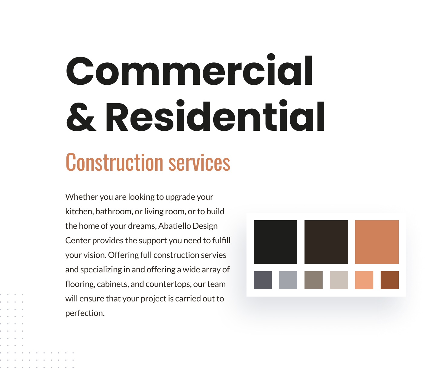
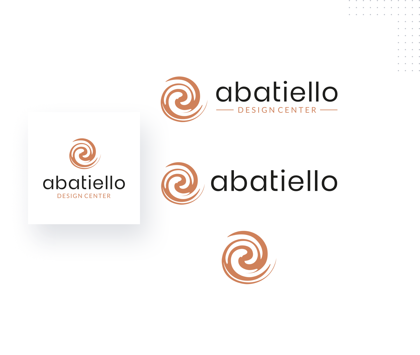
The font is set in a clear and readable fashion to reflect the brand’s image. Meanwhile, browns blended with oranges and greyish color schemes, creates a pleasant appearance that fits perfectly within construction branding with an inviting feel.
Title font
Poppins Bold & Semi Bold, a newer sans serif font, based on pure geometry, particularly circles.
Title font
Lato Regular, a Sans Serif font with great readability and elegant appearance.
Decretive font
Oswald, a simple, a bold and outstanding Sans Serif font, used for special purposes, such as text highlights, subtitles, quotes, etc.


After making changes with the font styles and typeface, the new logo showcases a better look that is elegant and professional. Most importantly, the new logo is easy on the eyes while keeping the same professional feel and recognizable look.
Logo placement and background variations are paramount decisions for any brand that wishes to present itself in the best possible way.

Designing a logo for digital use is one aspect of effective logo design, but other applications are taken into consideration so the logo and icon can be used in multiple applications and uses.

